The RevIQ brand
Everything you need to represent RevIQ accurately — the logo, our colors and type, and a few simple rules. Press and partners are welcome to use these assets within the guidelines below.
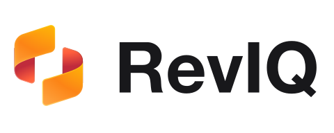
One logo, two surfaces.
Use the full logo wherever space allows. Choose the variant with the most contrast against its background — dark on light, light on dark. Keep clear space around it equal to the height of the mark, and never place the logo on a busy or low-contrast background.
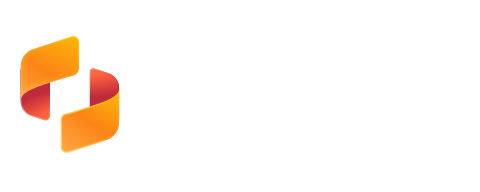
The mark, on its own.
Use the symbol where the full logo won't fit — favicons, app icons, avatars. Keep its colors; never recreate or recolor it.
A warm core, a confident accent.
The gradient mark carries the warmth; ink and a single blue do the work everywhere else. Tap any swatch to copy its hex.
One typeface: Inter.
Inter carries everything — headlines, body copy, and tabular data. It is open-source and variable, so weight and rhythm stay consistent across the product and the site.
A few rules keep it recognizable.
- Use the supplied logo files, unmodified
- Keep clear space around the logo
- Use the variant with the most contrast
- Use the approved brand colors
- Recolor, rotate, or distort the logo or mark
- Add shadows, outlines, or other effects
- Place the logo on busy or low-contrast backgrounds
- Rebuild the wordmark in another typeface
Questions about using our brand?
Reach out and our team will help with the right assets and approvals.